


The top used Instagram photo filters currently revolve around four visual techniques: brightening, sharpening, saturation and contrasting. It’s all about posting a photo that will stand out in the social feed.
Many baking and snack companies designing or redesigning their packages are on a similar track; in fact, one could say they’re channeling the same filters used on Instagram — but this time it’s to stand out on store shelves.
A vibrant appearance
An upbeat color palette that’s bright with high saturation helps a brand pop and also differentiates one flavor in the brand from another. To contrast and add depth, these colors are typically paired with a base of black or white for modern packaging.
Hanover, Pa.-based Boulder Canyon’s original chip packages included a variety of darker-toned shades. Its new design incorporates white and one highly saturated color — green, lime green, red, purple, blue, or orange — that covers half of the chip bag. Additionally, the outdoor-mindset company uses this contrast in its overarching design of a nature scene that uses the bright color as a landscape and white for the sky, with chips acting as mountains connecting the two.
The new bar wrappers from R.E.D.D., based in Portland, Maine, put vibrant background colors with white lettering and feature the company’s tagline “Radiant Energy Deliciously Delivered.” The goal was to change its bar branding approach to reflect the young consumer perception that eating well and looking good are connected.
“When looking at our audience, and also at bigger consumer trends in the marketplace, we found that pop colors and playful graphics complement the lifestyle of the millennial generation who see nutrition, fashion, and social media as all interconnected ways of self- expression,” said Peter Van Alstine, chief executive officer, R.E.D.D.
Communicating with clarity
Contrasting colors also give packaging a clean look, which is essential for making information visible. Companies use terms to describe their modern design goals like “clean,” “easy to read,” and “simple,” showing the push for clarity.
In January, Brooklyn, N.Y.-based Z Crackers changed its packaging to include a bright and sharp design that emphasizes its brand name on the front.
“The bolder the package, the more Z’s stand out,” said Pam Pollack, co-owner and chief designer, Z Crackers. “Store managers have told me that shoppers gravitate toward Z’s new colorful design, making them a refreshing standout in the specialty cracker category.”
With health and wellness still at the forefront of consumers’ preferences, purchasers are looking for diet and ingredient callouts, so easy-to-read fonts are also crucial. This includes emphasizing what ingredients are included in the product, how much of that ingredient is included and what kind of diet it is accommodating.
Mason Dixie Biscuit Co., Washington, recreated its packaging in February with a black background and lettering in white. A pop of bright turquoise highlights how the product is made with seven simple ingredients and its taglines “voted best biscuit in America.”
The realistic approach
While people posting on social media use filters to make everyday life brighter, more colorful and sharper, they also are always mindful that they want their photos to look authentic. In the same way, baking and snack companies can develop engaging packaging and bring in the realness aspect.
The artisan crackers from Z Crackers come in recyclable clear tubs so that consumers can see their product they’re buying. Oat My Goodness’, Potomac, Md., new stand-up pouches have a clear, front-of-bag window that showcases the granola clusters. This transparency can be a way for consumers to verify the ingredient simplicity described on the packaging itself, too.
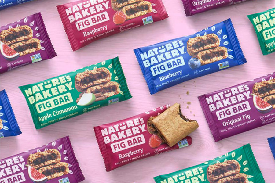
Another way to promote the product visually is including an authentic replica of it on the package. The old fig bar design from Nature’s Bakery, Reno, Nev., showcased figs on the front, but its new package has a picture of the actual fig bars for “appetizing product imagery.” This method allows for consistent packaging materials while bringing the realness consumers are looking for when shopping.
As modern packaging moves more mainstream, it’s important that a design represents and is inspired by a brand. This will set companies apart in addition to the contrasted coloring and sharp art. So just like scrolling through Instagram, the filter — or package design elements — will peak someone’s curiosity and make them stop in their tracks.