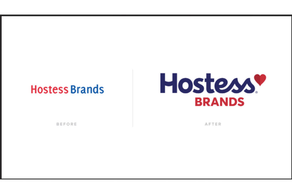
LENEXA, KAN. — Hostess Brands, Inc. has introduced a new corporate logo featuring the word “Hostess” in a deeper, darker blue and the word “Brands” in red. The new logo also includes a dual-tone red heart, which Hostess said “honors its legacy while turning the page toward Hostess Brands’ bright future.” The new design was created in collaboration with New York-based brand design agency CBX.
Hostess’ old logo featured the word “Hostess” in a brighter red and the word “Brands” in a lighter blue.
The consumer brand design that is used on the company’s retail baked foods remains the same.
“Today’s Hostess Brands is a modern, innovative, disciplined and thriving snacking company,” said Andrew P. Callahan, president and chief executive officer of Hostess Brands. “Over the past two years, our business has consistently achieved over 9% growth each quarter. We’re incredibly proud of the progress we’ve made, and we are just getting started. At the end of the day, you can’t just tell people we’re a different company. You have to show them, too.”


